TWINKLE TOTS
An app to find reliable, trustworthy, and affordable childcare!
PROJECT DETAILS:
Role: UX Designer
Team: Solo with a mentor who has provided good ongoing feedback & usability test participants.
Time: 120 days
Client: Student project at Springboard.


TLDR
THE PROBLEM:
To develop a product that will help parents find a reliable, trustworthy, and affordable childcare through an app that is similar to Yelp for childcare.
SOLUTION:
Developed an app that helped users to find schools, daycares closer to their homes based on the ratings and reviews of other parents.
IMPACT:
Parents loved this concept of having to find daycare based on reviews and ratings, and also programs offered by schools. The Apps engagement has increased when we collaborated with schools to be a part of the community on the app.
OVERVIEW:
The project Twinkle Tots is a childcare app where users can search for daycare, Montessori, or after-school care for children. On the provider side, this product helps daycare, Montessori, or after-school programs showcase their facility and care details and interact directly with users through messaging.
Discovery
Today, most parents are busy with their work schedules and would like a helping hand in their children's early development. On the other hand, busy parents and children need an environment where they can see and learn from their peers, who should be reliable and trustworthy people or organizations at an affordable price.
“The work of education is divided between the teacher and the environment.” ~ Maria Montessori

RESEARCH:
I have researched the problem to get more insight into how this affects parents and childcare providers. Sharing some highlights of my secondary research and findings-
Childcare costs vary from state to state based on different factors.
Parents are interested in providing the best that is available in the market.
Free childcare for low-income families or government, or private companies included policies or discounts.
User Interviews
I conducted user interviews with 5 participants to identify the pain points of finding childcare for their children. Below are some highlights from the interviews conducted-
There was no place to look up information and compare information other than Google search.
One user said they moved to a new home and had to rely on Google search results from multiple schools and on word of mouth.
The users often looked for schools near their homes or offices for easy pickup and drop-off.
The pain is moving kids to different schools based on their age and needs.
Affinity Mapping & Thematic Analysis
USER PERSONA:
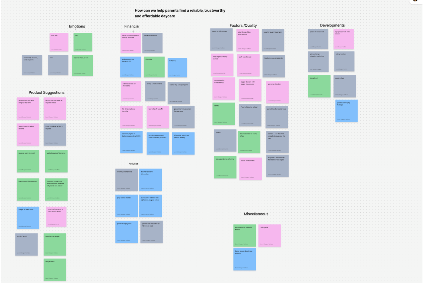
From the above notes, I have chosen the pain points that were very common among the users I have interviewed and developed solutions against them.
Three key user goals emerged from the research:
1) to have kids of similar age groups, 2) a play-based curriculum, 3) affordable pricing.

Ideating and finding a solution:
“The how might we” question approach was used to generate concepts
How Might We:
How might we create awareness among users regarding affordable options available for childcare?
How might we help users find information regarding childcare centers near their locality?
How might we help the parents find childcare that includes a play-based curriculum and also provides preschool?
How might we help users prioritize different factors of a caregiver to identify the right caregiver for them?
How might we provide information regarding activities in the childcare facility?
Heuristic Analysis:
As part of the research process, I conducted a heuristic analysis to examine the existing real-world apps related to childcare and the services they provide. I also wanted to investigate potential competitor apps such as UrbanSitter, Care.com, and Brightwheel, which allow users to perform similar actions but have limitations. I aimed to address those limitations while providing access to more valuable resources.
Brand
Moodboard and visual representation: Twinkle tots will be competent, simple, and exciting. Hence, I created a mood board with all the inspiration I could find regarding colors, imagery, and theme.
PROTOTYPE:

WIREFLOWS & LOW- FI SCREENS

RED ROUTES:
User flows and Hi-Fidelity screens for those routes-


Usability Testing:
After successfully creating a prototype, I chose five users, of which two were daycare providers and three were parents, to test the prototype and found some exciting inputs-
Round 1:
Initially, none of the participants found the images on the app relatable to the childcare theme.
For the appointment functionality, they asked to include time slots and have a legend
3 out of 5 users could not locate the search icon and were looking for a search bar with a filter.
Consistency in design
After round 1, I gathered major issues, re-iterated the prototype, and went ahead to conduct the second round of Usability testing-
Round 2:
Users wanted to see more Insights from other parents.
Images still could be improved.
Daycare providers and Users see more potential in the app.
The users said the app was “UNIQUE, easy to use, and HELPFUL.”
Learnings
Yay! We finally reached the end. It was a fun process from the root to the end of addressing, designing, and testing a whole product. However, I have learned a lot and wanted to share what I could have done differently the first time.
CONSISTENCY
Users depend upon consistent design and interaction patterns. They look for familiarity and relatability. We all rely on insights and reviews from others before we try out something new.
ATTENTION TO DETAILS
As a designer, I may have missed some tiny details, but users pay attention to those tiny ones that make their lives easier. Talking to users and learning from their pain points helps provide a better UX. I see so much potential in this app and would love to add more features.